It was featured in "The West Wing," but map dishonesty is anything but fictional. Check out this clip to get an accurate look at the size of Africa.
|
I considered titling this post "Mind Blown," but I figure I'll save that for something that is even more amazing than this. I would give a brief explanation of what this is, but I really think you should just click on the link and spend a few minutes checking it out.
In this article from The Atlantic, Mark Edmundson explores some ideas about selecting a college that you probably have not thought about yet.
This article features nine graphs that should make you think about how the world will be different when Nigeria has more people than the United States. The graphs are neat even if you don't read the whole article.
This article from the Washington Post explores the world through maps. Some are actual maps and others use maps to display global feelings and trends like the one below. 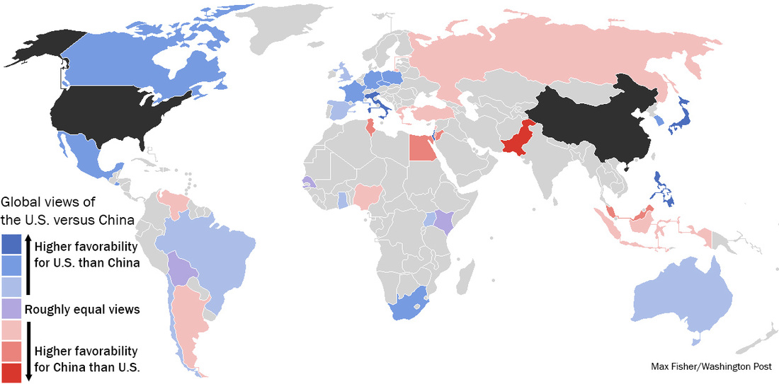
|
Mrs. Saha's BlogA place to share all the interesting things I find on the web with students. ArchivesCategories
All
|
 RSS Feed
